Charts
Objective: Gain an understanding of how to add a chart to an Advanced Search Profile.
Charts provide a graphical representation of search data.
Charts are displayed on the Advanced Search Profile Dashboard page and can be assigned to widgets on Dashboards through the system.
Multiple charts can be created per Profile via the "Charts List" box, from the Charts tab of a saved Advanced Search profile:
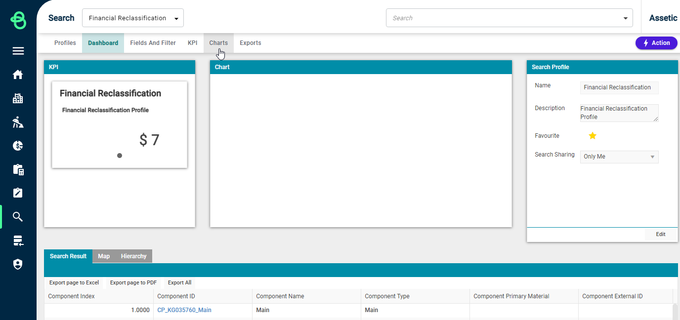
Click the "Add" button in the 'Charts List' section and select the type of Chart to add to start the process of creating a new chart.
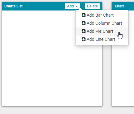
Creating a Chart
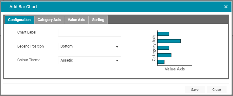
-
Chart Label: The name of the chart, which gets displayed on the header of all Dashboard tiles.
-
Legend Position: Determines the legend positioning (or removes it completely).
-
Colour Theme: Sets the chart's style and colour from a number of preset themes.
Click the "Category Axis" tab to begin configuring the data series for the chart:
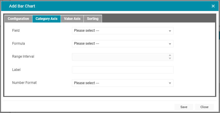
-
Field: The primary data field being graphed.
-
Formula: Formula allows for data grouping, depending on the type of field used by the Category Axis. For example, a date field can be grouped by week, month, or year.
-
Range Interval: Available for numeric fields when the Formula is set to group by Range, this allows the interval of the grouping to be set.
-
Label: The name for the axis, as it will appear on the chart.
-
Number Format: This allows users to select the number format for the category axis: Metric (k, M, G), 1000 Separator, or 1000 Separator with 2 Decimals.
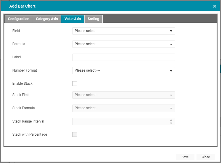
Click the 'Value Axis' to continue configuring the chart:
-
Field: The secondary data field being graphed.
-
Formula: The formula to use when displaying the values in the chart. The options available will depend on the type of field and the type of chart chosen.
-
Label: The name for the value axis, as it will appear on the chart.
-
Number Format: This allows users to select the number format for the value axis: Metric (k, M, G), 1000 Separator, or 1000 Separator with 2 Decimals.
-
Enable Stack: A checkbox which will allow for the configuration of stacking. Available only for Bar and Column charts.
-
Stack Field: Sets which field the Value Axis will stack.
-
Stack Formula: If the Stack Field is numeric, the Stack Formula can be set to 'Range'.
-
Stack Range Interval: Determines the interval of the range by which to stack the Value Axis.
Click 'Sorting' to configure the display of the Chart further:

-
Show Top X Values: Determines how many values to display on the Category axis.
-
Sort axis direction: Determine what order to display the values on the specified axis.
Click "Save" to save the chart series data and then click "Update" to display the chart:
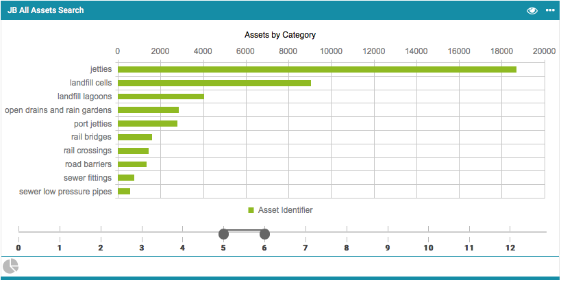
NOTE Charts utilise pagination in order to limit the amount of data being displayed. In the example above the slider at the bottom is set to display data for pages 5 to 6.